


Get help finding your perfect window coverings.
Request a consultation today!


Program your window treatments so that they adjust themselves automatically, creating the perfect room ambiance morning, noon and night.
Learn more about Hunter Douglas custom window sheers, including our shadings and privacy sheers. Innovative, light-diffusing sheers. Your trusted source for window treatments.
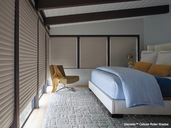
Cellular honeycomb shades from Hunter Douglas. An energy-efficient design that traps air in distinct pockets to help keep your house cool in the summer and warm in the winter.
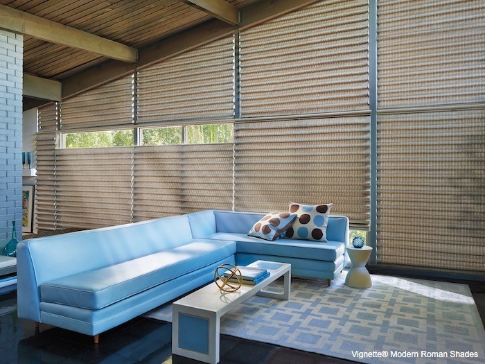
Custom-made fabric Roman Shades by Hunter Douglas, combining the look of soft folds with the ease and convenience of a shade. Custom-crafted.
The Hunter Douglas roller shades & solar screen shades collections offer excellent light control and a clean, stylish look in a range of fabrics and materials.
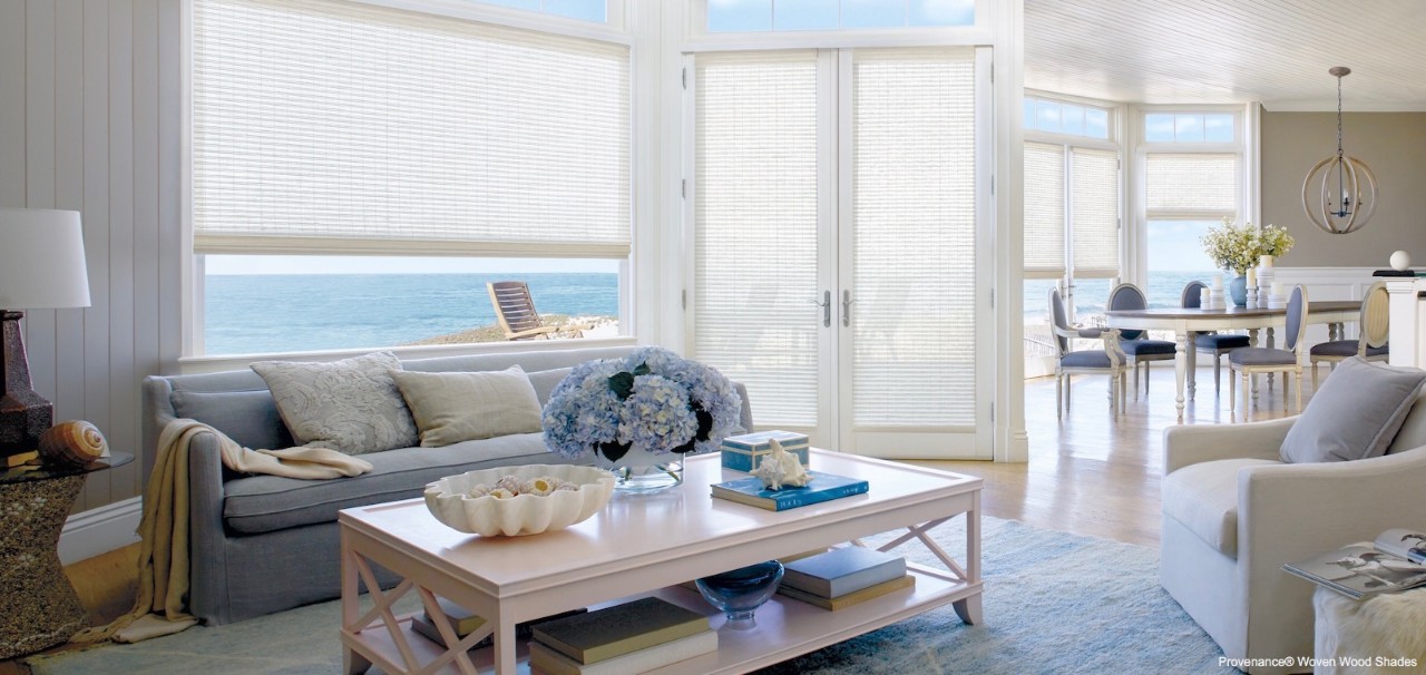
For a warm, natural look our Hunter Douglas Woven Wood Shades collection of window treatments transforms sunlight into captivating design statements. Choose yours today.
Find the right custom vertical shades for any room in your home. Search our most popular window shades.
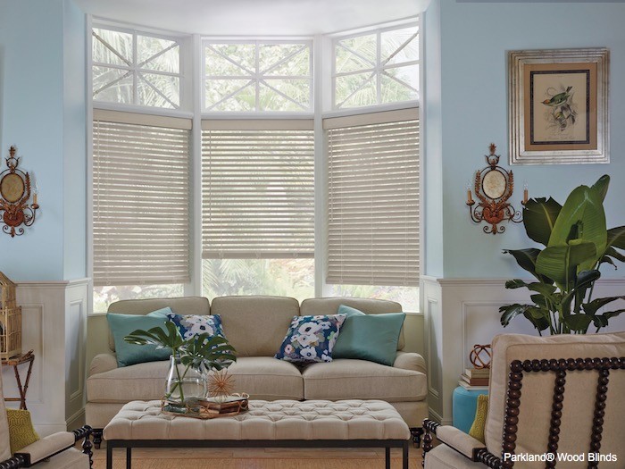
From controlling light to their stylish, sleek look, wood blinds have been a favorite among homeowners for decades.
Find the perfect metal blinds for any room in your home. From controlling light to their stylish, sleek look, metal blinds have been a favorite among homeowners.
Discover Hunter Douglas customized vertical blinds featuring elegant styling and translucency in a large selection of colors, treatments, and textures. Lifetime guarantee.
Hunter Douglas custom window shutters provide superior light control and privacy with classic styles, long-lasting finishes, and exceptional craftsmanship.
Choose from timeless and on-trend fabrics, including lofty textures and alluring jacquards, artisanal embroideries and luminous sheers.
Enjoy the beauty of natural light and make any space more captivating, with the following light-enhancing shades.
Want a darker room for better sleep or optimal movie binging? These shades and drapes help block light at the window.
Live comfortably and save energy with these shades. Designer to keep a room warm in the winter and cool in the summer.
Manage natural light and add privacy with these window treatments that work well for sliding-glass and patio doors.
Create a quieter, more relaxing room with these window treatments, which help absorb sound, reducing exterior noise.
For privacy and natural light, position shades from the top, bottom or both. These shades have this feature available.
Add the perfect finishing touch to your windows.
Our schedule is flexible, and we can come to your home for a consultation.
See current and past decorating ideas from our 'Fresh Ideas' Newsletter.
See window covering solutions for privacy and moisture-resistance.
See window covering solutions for privacy and room darkening.
See window covering solutions for light filtering and glare control.
See window covering solutions for a variety of needs and kitchen styles.
See window covering solutions for light filtering and UV protection.
See room darkening window treatments for your media room.
See child-safe window coverings for baby nurseries and kids rooms
See blinds and shades for angled, sloped, and triangle-shaped windows.
See blinds and shades for arched, half-circle or half-moon windows.
See blinds and shades for bay, bow and corner windows.
See shutters, blinds and shades for French Doors.
See blinds and shades for sidelight windows.
See blinds and shades for patio and sliding-glass doors.
See blinds and shades specifically suited for skylights.
See all options for automated blinds and shades.
See our options for blinds and shades that best control light.
See blinds and shades that help save energy at the window.
See blinds and shades for light filtering and UV protection.
See blinds and shades that are safer for children and pets.
Get help finding your perfect window coverings.
Request a consultation today!
Thank you for reaching out, we appreciate it! One of our staff members will contact you shortly.
Something went wrong. Please try again later.